Data Visualisations using Waste Data Interrogator
Across the industry there is growing interest in how waste actually moves across England. Operators, local authorities and large waste producers all talk about the need for transparency, better evidence and clearer supply‑chain visibility. Yet much of the underlying data sits in difficult formats or is not easily interpreted without specialist knowledge.
We wanted to show what is possible when waste expertise is combined with proper data handling. This piece is an example. It uses public data sets, a clear methodology and a visual approach to tell a story about how waste travels from the North West to disposal sites across England.
You can explore the interactive Kepler map below. It is fully usable in the browser. We encourage you to play with the layers and filters and to get in touch if you want to understand what else we can reveal with similar techniques.
Why We Chose This Data
Every year the Environment Agency publishes the Waste Data Interrogator. It is a rich but complex data set that describes movements of waste between origins and treatment or disposal sites. It covers hundreds of thousands of individual entries. It is not easy to work with if you want to derive any meaningful patterns.
We extracted data from 2019 to 2024 and focused on movements where the origin point is within the North West. This gave a consistent geographic frame and allowed us to highlight both regional behaviours and national dependencies.
Turning Difficult Data Into Something Useful
To create a map like this you need to bring together several pieces of information that are not provided in a single place.
Origins
The Waste Data Interrogator records origins as local authority districts or as larger regions. That means there is no direct latitude and longitude. We sourced the centroid coordinates for each area from the ONS. This allowed us to place every origin accurately on the map.
Destinations
The data contains permit references for disposal sites. To convert those into actual locations we used the Environment Agency public register, matched the sites and recorded their coordinates.
Structuring the movements
Once we had origins and destinations geocoded, we restructured the data so it could be uploaded to Kepler. This included cleaning, filtering and reformatting several years of entries into a single coherent model.
Building the map
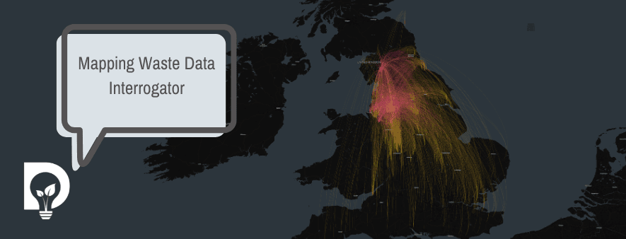
Kepler.gl is very good at rendering complex spatial relationships. We used it to create the arc map shown here. It displays the origin of each movement in the North West and the path to its corresponding disposal site anywhere in England. The colour weighting in the arcs helps highlight the intensity of movement along certain corridors.
The result is the visual you see here.
What the Map Shows
The visual highlights a simple but important point. Waste generated in the North West flows across the country into a wide range of facilities. Some flows are predictable and local. Others move surprisingly far. This picture helps illustrate the interconnected nature of the industry and how dependent we all are on infrastructure across multiple regions.
It also raises questions that cannot be answered purely from looking at static spreadsheets. Which facilities are key nodes. Where capacity is most strained. How different waste types behave. How movements change over time. These are exactly the kinds of questions that richer data work can support.
Why We Think This Matters
At Dsposal we believe that compliance, assurance and operational performance all improve when organisations understand the data behind them. This map is a practical demonstration of that belief. It shows what becomes possible when you combine waste industry knowledge with the ability to structure large public data sets.
It is not a polished research project. It is simply an honest example of the type of analysis many organisations say they would like to do but do not have the time or technical skills to deliver.
Explore the Map and Talk to Us
The map is interactive so you can zoom in, filter and explore the flows in your own way. We encourage anyone working in waste, compliance or environmental performance to spend a few minutes with it and think about what similar analysis could show for your own organisation.
If you want to discuss how we created this view or what else we can do with your data or public data sets please contact us. We are always happy to talk about the work behind the scenes and how it can support better decisions.